Monday 27 November 2017

Hygge: Cosy Fashion for Winter 2017

Hygge: Cosy Fashion for Winter 2017

It's autumn 2017, and I think by now we've all seen the word 'hygge' appear in some shape or form. If you haven't, hygge is a convenient Danish word (pronounced hue-guh) for something that has a certain cosiness to it. It's a little more than a feeling - although that's what we, as the non-Scandinavian variety, tend to pigeonhole it as - hygge is more like a state of consciousness, where you're relaxed, secure and contented with the present moment. It has a simplicity to it: hygge can be the act of lighting candles in your living room, or slowly sipping a cup of hot chocolate in your favourite chair. You can even find hygge in a homemade stew, or a dressing gown that's been hanging in the airing cupboard.

For many of you reading this blog, fashion might be the way to achieve a sense of hygge this winter. Take the humble chunky knit; a quick Google search drums up 22.7 million results for this phrase, and you can spend hours scrolling through thousands of chunky knit jumpers, scarves and cardigans on Pinterest - I think I even saw a skirt on there once - which means that plenty of us are on the fashion hygge bandwagon.

Hygge: Cosy Fashion for Winter 2017

If you've been on the search for the perfect chunky knit jumper yourself, you'll have probably spied the hundreds of imposters on the high street. The ones masquerading as chunky when in fact they're thinner than the ice you're standing on when you don't reciprocate your mother-in-law's Christmas
card. Either that, or they feel so synthetic that you'd become worried about standing next to an open  flame (there goes those candles I mentioned). What we all want is a proper chunky knit - one which engulfs us but at the same time looks premium quality and super chic, like February-New-York-Fashion-Week-street-style chic.

When I picture my perfect chunky knit jumper, it most definitely has an absurdly long turtle neck which I can bunch up to my ear lobes, as well balloon sleeves that are big enough to look deliberate, but small enough to fit under a coat if needed (no one wants to look like they've forced their arms into a jacket that fit them perfectly fine the month prior). Finish off the look with a warm neutral shade and I'm sold.

Hygge: Cosy Fashion for Winter 2017

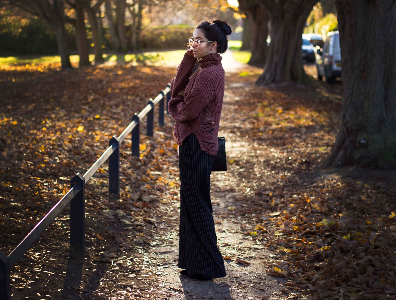
Is it too late to mention that I'm describing the gorgeous Tobi jumper that I'm wearing in these photos? I have to admit, I'm just a little bit in love with this. The silhouette is perfect, and the rips up the sides are a surprising addition to the aesthetic. Not only does it look cosy - it feels cosy. I've been wearing this both with coats and without, and I've felt nothing but toasty. Here, I've coupled the jumper with a pair of black, pinstripe, wide leg trousers from Bershka, some black, heeled ankle boots (which you can't see due to the length of the trousers), a black bag from H&M and some pink tinted glasses from zeroUV. This is a semi-casual look which I wore to go to the cinema with my boyfriend; however, I could easily wear this to work and feel both stylish and comfortable.

This is just one way you could wear this jumper, but I've also paired it with ripped, light blue denim jeans and white plimsols, as well as black skinny jeans and thigh high boots with just a bralette underneath. The thing about chunky knits is that they're versatile - throw one over a sequin mini dress you bought last year, et voilá: you've got a whole new outfit.

What would you pair with a chunky knit jumper? Let me know in the comments below!

Hygge: Cosy Fashion for Winter 2017

SHOP THE LOOK: JUMPER, TOBI / TROUSERS, BERSHKA / GLASSES, ZEROUV


FOLLOW ME ON INSTAGRAM
FOLLOW ME ON TWITTER
SUBSCRIBE FOR FREE ON BLOGLOVIN'
Share:

Sunday 19 November 2017

How to Make Your Nail Polish Last Longer

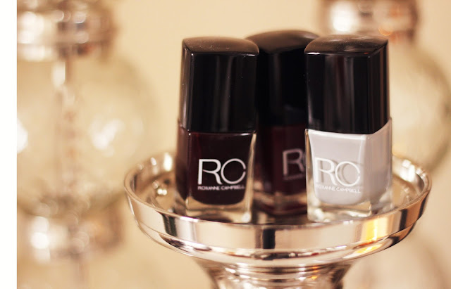
Roxanne Campbell Nail Lacquer by Jen Lou MeredithAfter trying gel nails, I have to admit that I went off regular nail polish for a long time. I didn't see the point in wearing it - I could get gel nails at my local salon for £15, along with a manicure, and the results would last two weeks. No chipping, no fading, no waiting for the polish to dry. 

However, it was a while before I realised that, actually, gel nails are a lot more impractical than I thought they were. £15 every two weeks racks up to £390 a year. £390 spent on nails. You could buy a holiday with that. On the other hand (quite literally), one bottle of Roxanne Campbell's Nail Lacquer - my new favourite option - will set you back just £10 and last you a good 20-30 applications.

Not to mention, I'm so fickle when it comes to colour. One day I'm all about the neutrals, the next I feel like Nicki Minaj performing Super Bass at the 2011 Victoria's Secret Show, so as you can imagine sticking with one colour for two weeks can leave me itching for a change.

Now, when it comes to regular nail polish there's still the problem of chips, which isn't a sight anyone wants to see. Without seeming too prim and proper, chipped nail polish just looks untidy. However, none of us have the time to sit there and reapply nail polish every time it chips, which is why you want to get it right first time.

I talked to Roxanne Campbell, founder of her namesake brand, and nail artist to the likes of Adele and Jourdan Dunn. She has worked with some of my favourite designers, including House of Holland, Acne and Karen Walker, and even recreated the national flags on the nails of competitors at the 2012 Olympics. Roxanne gave me a few pointers on how to make your nail lacquer last longer, keeping those chips at bay for 4-7 days.

Roxanne Campbell Nail Lacquer by Jen Lou MeredithROXANNE SAYS:

1) Wipe your nail plate with acetone nail polish remover using a cotton pad. This will remove any trace of product or oils. Nail prep is the most important step to ensure your nail lacquer doesn't chip as fast!

2) Apply one thin coat of RC Base Coat. This will protect your natural nails from staining.

3) Apply one to two coats of your chosen colour for full coverage.

4) Apply RC Top Coat. This will protect your nails, create a super-shine finish and prevent your lacquer from chipping fast.


Roxanne Campbell Nail Lacquer by Jen Lou Meredith
THE VERDICT

I painted my nails on a Wednesday evening, following Roxanne's instructions, and sure enough they only started to chip on Sunday - mostly on my right hand, which is the hand I use most.

If I were to add to the above tips, I would advise you to try dabbing the brush on the top edge of your nail to 'cap' off the polish. I've found that this helps prevent chipping on the top edge of the nail. Also, try not to pool the polish at the bottom of the nail as this will create a thick layer which will be prone to lifting and peeling. Follow these rules, and you should be set!

The polish I'm wearing in the image to the left is Roxanne Campbell's Nail Lacquer in Stormy Weather, which you can find on the brand's website (available here).

Do you have any nail polish tips? Let me know in the comments below!

FOLLOW ME ON INSTAGRAM
FOLLOW ME ON TWITTER
SUBSCRIBE FOR FREE ON BLOGLOVIN'

Share:

Monday 13 November 2017

How to Take Better Photos of Food


Today is the age of the food blogger. Sit down in a restaurant for twenty minutes and you're bound to see someone taking photos of their freshly prepared fare, whether they're a blogging pro with 20k followers or an occassional Instagrammer with a private profile. Why do we do it? Because food is the new fashion, with plenty of eateries making their dishes look Instagram-ready so that you - prior to devouring - can upload it to social to brag to your friends and, in turn, provide the restaurant or café with free marketing. Yup, everyone's at it, from New York-based Cha Cha Matcha's millennial pink and green interiors to Starbucks' name fails - make your food (or drink) go viral and customers will fall over themselves to eat it.

But because everyone has a cameraphone these days, and they're all taking photos of their food, how do you, as a food blogger, make your content stand out? Well, for every 100 blurry iPhone shots taken with flash lighting (bleurgh), there's one thoughtfully planned out image which makes you want to turn on the stove and rustle up something equally delicious (or step out to your nearest Café Rouge). In that image, you'll usually find natural lighting, interesting composition and a pleasing filter - as well as the most important part: a tasty dish.

I chatted with chef and author Anna Barnett (right, creating the perfect dippy egg at a workshop at Food at 52 with Heritage Breeds), whose moody food photos have attracted over 19.5k followers on Instagram. Anna's theme consists of mostly neutral tones with a pop of colour, like a bright orange egg yolk or a juicy green pear. Her shots of the food she cooks are often taken from above, but she juxtaposes these with pictures of architecture, interiors and even her very fashionable outfits. The main thing I noticed about Anna's Instagram account is that she's always playing with texture - a raw, wooden table here, a marble mosaic tray there - making every shot interesting for the viewer.

In this post, I'm going to go through three photography elements that Anna, and many other food bloggers, consider when they're taking their food shots. Remember these each time you take a photo of your food, and they'll hopefully help you put the 'hot' back into 'photography'.

1. COMPOSITION

Before you position your dish, take a moment to think about the composition of your photo. Where are you going to take the shot? Will it be on a table, a tray, or even a richly coloured ottoman with a blanket loosely draped over half of it? Decide whether you want your background to play a large part in the image or whether you want your food to do all the talking. Popular backgrounds for food photography include marble and wood, but you might want to try something different, like polished concrete or glass bricks.

Once you've established your background, think about props. Ask yourself, 'What would make this photo that little bit more interesting?' Maybe it's a pretty blue saucer that you found at a vintage market, or gold cutlery that you picked up from Zara Home. As Anna told me, however, try not to add in things that you wouldn't actually use while you're eating your food - it'll just look strange. Instead, try candles, bouquets of flowers or cookery books. Position them so that they're slightly out of the frame - too many props lining up with each other or with the edge of the frame can look forced.

Once you've got your props, position your dish. It's a good idea to do this last, so that you can eat it right after you've taken the photo without having to worry about my previous two points. 

2. LIGHTING


Straight off the bat, Anna told me that good natural lighting is key. Why? Because it shows off the subject how it was meant to be seen - not with dodgy blue/yellow/red tones. Also, natural lighting will usually cover all areas of the photo, allowing you to achieve even tones throughout.

You might think that taking your shot outside is the logical answer, however, too much natural light can be a bad thing - especially if it's really sunny, as it can cause high levels of contrast or wash the details out of your image. Instead, take your photo near a large window, so that the light is filtered and not too strong.

If you can't use natural lighting because it's late in the day (or you've decided to have a midnight snack), use white or slightly yellow lighting to achieve a similar effect to natural light. Beware of shadows, though.

3. EDITING


Even pros edit their photos. You might think it's a bad thing to edit, or use a filter, but it's not. As long as you're not distorting the photo so far that you might as well have stolen an image right off Google, editing is the best way to put the final touches on your image.

If you're a rookie, start off with filters. If you haven't used them before, these are presets which allow you to add a 'look' to your image without fiddling around with details. Good apps for filters are VSCO, Snapseed and Enlight.

If you want to get a little bit more advanced, try using apps like Facetune or Filterstorm Neue. And there's always Photoshop if you can afford the software.

Below are two examples of food images that I've edited, the first using DSLR and the second using a Samsung Galaxy S7:

I shot this using a Canon 600D, then used a curves layer in Photoshop to dull the highlights and lift the shadows slightly. After that, I imported it into Facetune on my phone. I cropped the image, then used the Whiten tool to remove the yellow tones from the surface. I then used the Patch tool to remove the crumbs, before importing it into VSCO to apply the A6 filter to about +10.9. 


I shot the above image on a Samsung Galaxy S7 and imported it straight into Facetune. I cropped the image to get rid of extra hands, glasses and kitchen tools, then toned the surface using the Whiten tool. I used the Patch tool to get rid of a mark on the table, then used the Details tool to sharpen the details on these wonderful Heritage Breeds speckled quail eggs.

After that I imported the image into VSCO and applied the HB2 filter at full level.

How do you edit your photos? Let me know in the comments section below.

FOLLOW ME ON INSTAGRAM
FOLLOW ME ON TWITTER
SUBSCRIBE FOR FREE ON BLOGLOVIN'

Share:
© Jen Lou Meredith | All rights reserved.
Blog Design Handcrafted by pipdig